Full Size Digital Download (suitable for printing at up to 9″ x 12″) Available for $6.00
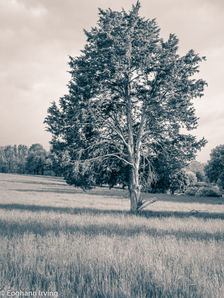
I’ve been walking past this tree for a few weeks now and it catches my eye every time. It stands apart from most of the other trees an has clearly been through some battles. However most times when I got past it has been sitting in shadow. On this particular morning though the dawn sun had finally made it’s way above the mountain and was hitting one side of the tree.

There were still problems though. For a start, I could not find an angle where the tree was completely separated from the line of trees in the background and as a result branches of the tree were merging into the the background. In the end this was the best angle I could come up with.
To increase the separation between foreground and background I converted the image to black an white. That helped slightly in that it focused on the most interesting element of the tree (the texture of the trunk an branches).
To enhance that further I adjusted several sliders in Lightroom:
- Texture
- Clarity
- Slight tweak to the Black an White Mix slider
- Adjusted sharpness, primarily by adjusting the mask setting
- Exposure
By this point I was fairly pleased with the look of the image, but I wanted to ensure that the viewer’s eye went to the tree above everything else. So I applied a radial filter over the tree that created a gradual darkening the further away from the tree you got and also reduced the sharpness and texture so that the viewer’s eye was less likely to be attracted to some minor detail at the edge of the image.
Full Size Digital Download (suitable for printing at up to 9″ x 12″) Available for $6.00
Discover more from Veristopia
Subscribe to get the latest posts sent to your email.


